Merlot Red Magazine: A Study in Color and Theme
In this project, I embraced the challenge of creating a magazine theme that is centered around a single color, showcasing its essence through the design. I chose the color red, specifically the shade of ‘merlot’, for its rich symbolism. Red is associated with power, passion, desire, love, and quality.

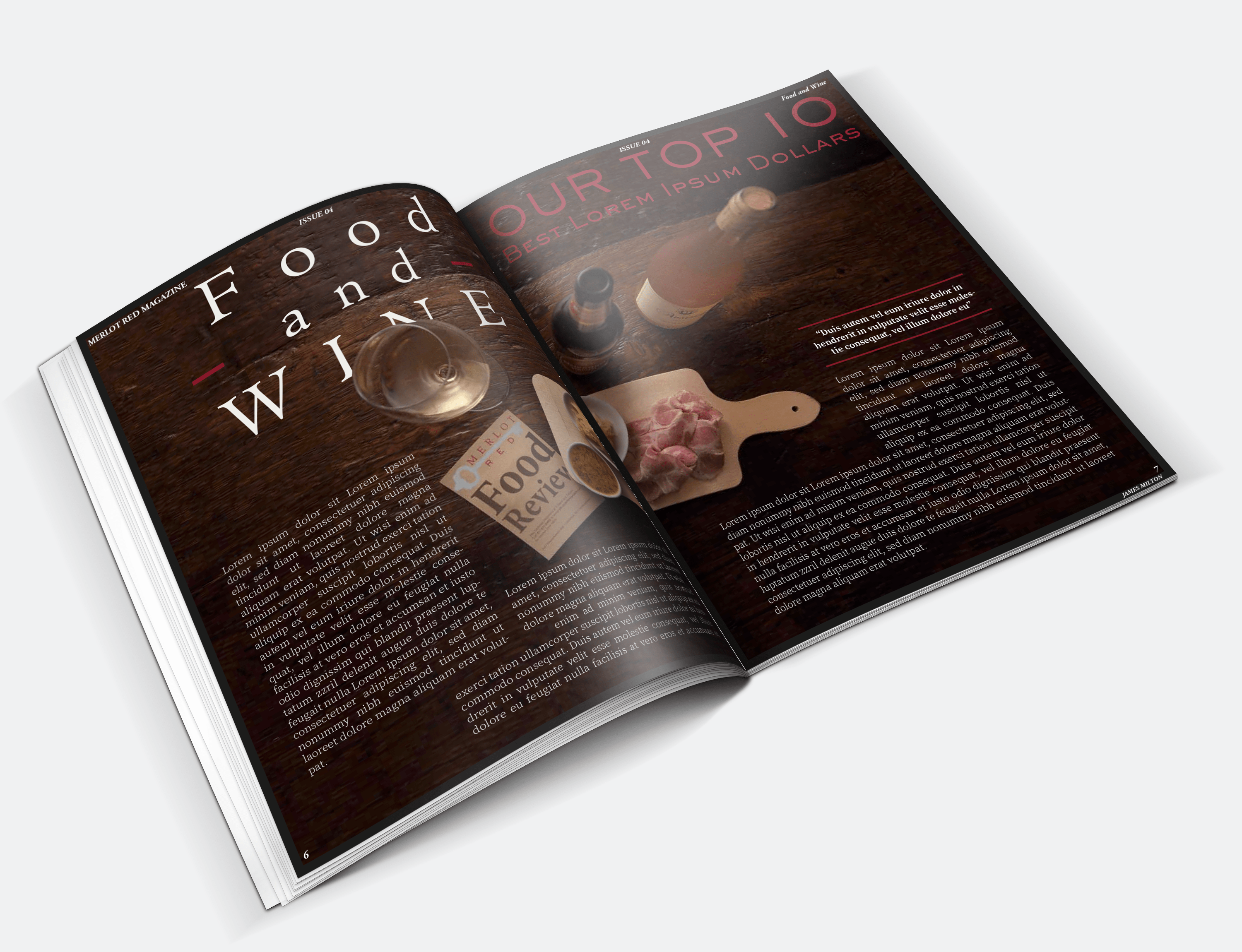
Merlot red’s high-quality connotation and the apt naming inspired me to theme the magazine around wine, targeting an audience that appreciates luxury and elegance. This approach aimed to establish a strong brand image, distinct from current wine magazines.

The magazine also explores the darker associations of red with blood and danger, introducing an element of mystery and promiscuity. This thematic choice offers adult readers an escape into a thrilling and enigmatic world, akin to that found in novels and books.
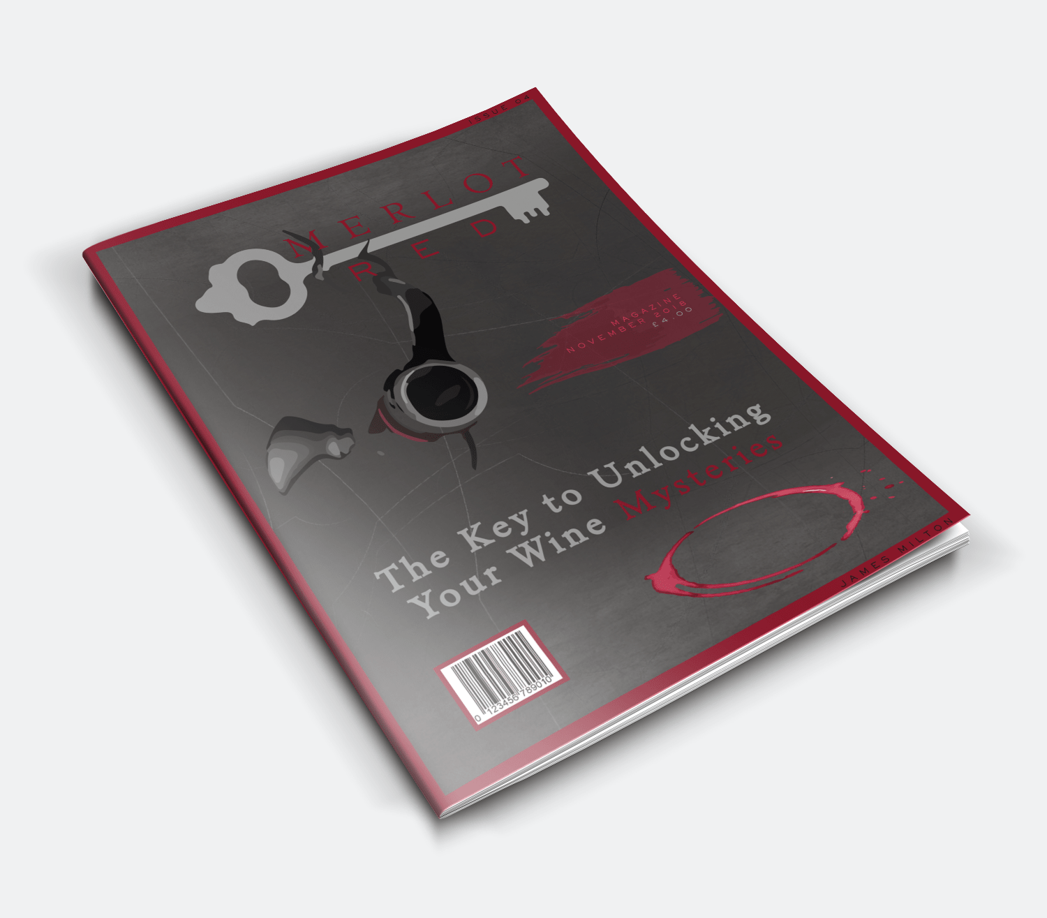
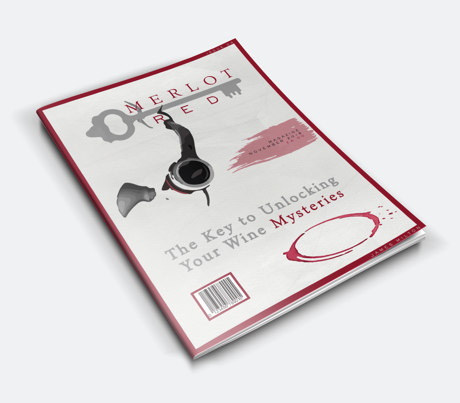
The front cover’s smoking wine bottle is designed to resemble a smoking gun barrel, embodying the themes of mystery and danger within a wine context. The wine ring stain plays on the idea of a blood mark, deepening the sense of mystery.
Final Outcome
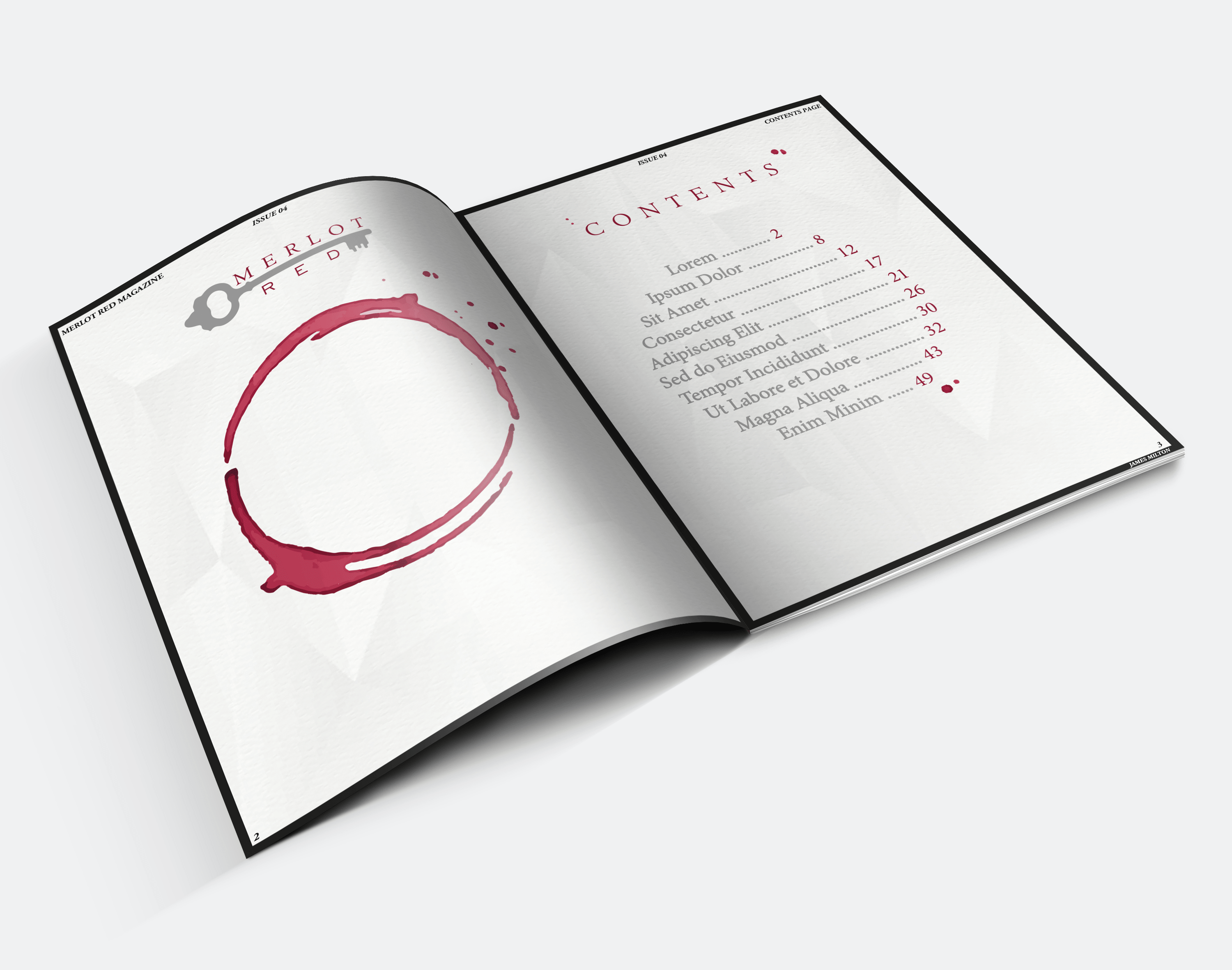
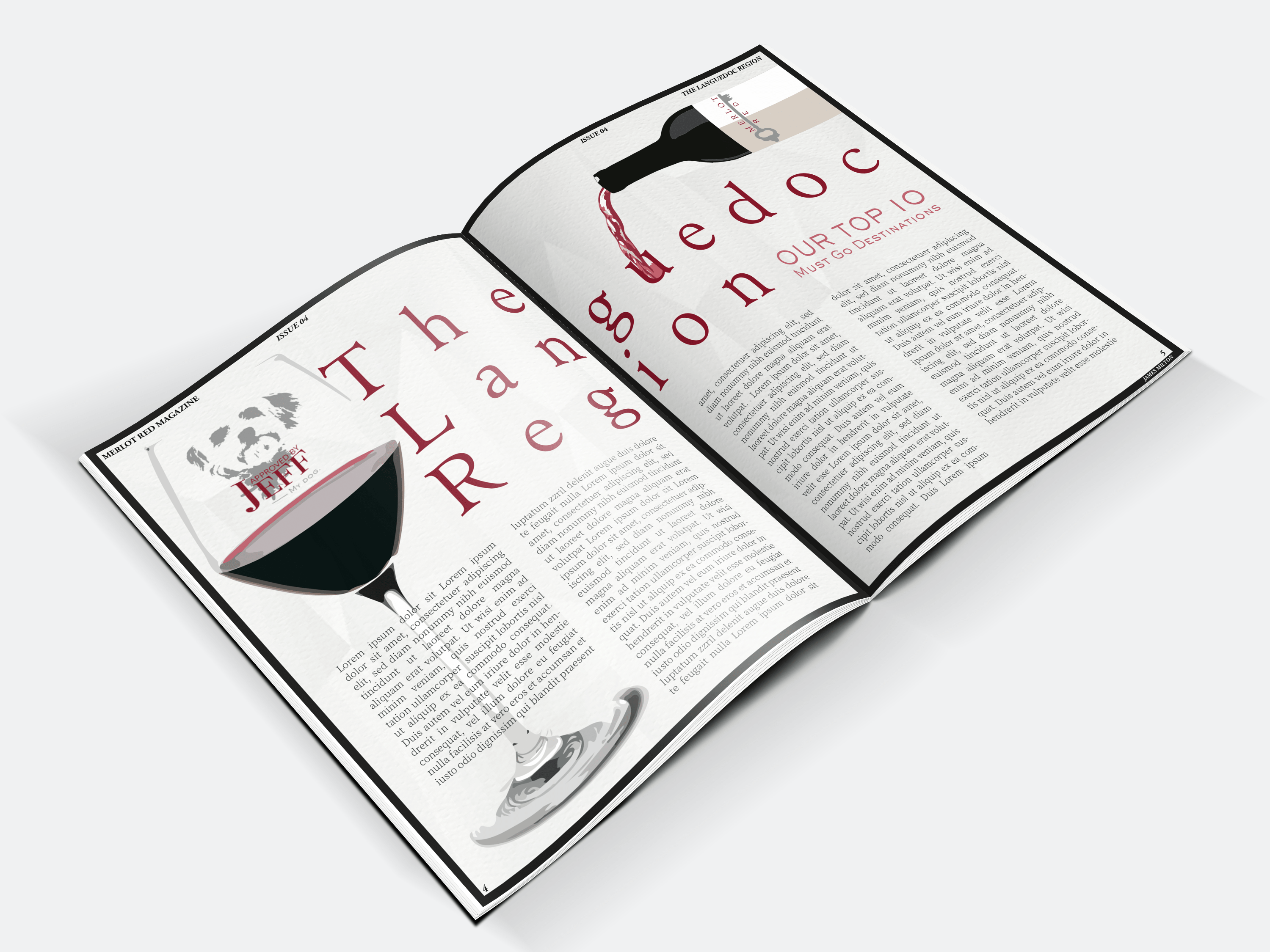
The resulting pages of Merlot Red Magazine combine the world of wine with an air of mystery and elegance. The magazine is envisioned as a monthly publication, rich with content about global wine destinations, food pairings, author reviews, and more.